and why not.
When I had posted this challah cover

I had learned how to do this cool trick from Ellen Alt, my calligraphy teacher.
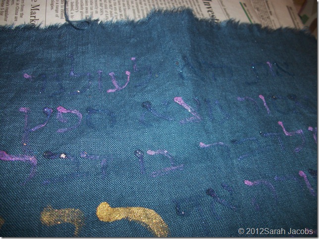
You work with two pots of color. Choose two colors that will look good when mixed. As you paint the text, alternate the colors you did your brush in. do not clean your brush between colors. See your kindergarten teacher spin in her grave, but just keep dipping your brush and not cleaning it between colors. The colors end up blending in a cool way.
You may notice that the text does not stand out as much as it usually does. as I was leafing through Shabbat z’miroti table songs I was drawn to this poem. Ki Eshmirah Shabbat. You can listen to the melody . It’s a great melody.
As I was calligraphing the text I remembered that I actually don’t like the words themselves all that much. You can see for yourself here Tranliteration and translation. This poem is a little bossy and directive. It’s more a list of rules than a lovely evocation of Shabbat.
A few years ago we spent Shabbat with a large group of my husband’s friends. My husband hates singing z’mirot , so we don’t. My husband’s buddy Allan and I were singing through the repertoire. I requested that we sing Ki eshmera Shabbat. A line or two in Allan reminded me that it was a great melody and not such a nice poem. He was right. If I liked the text better, I would have carefully outlined all of the letters so they would be easier to read easily. I’m happy with the vague impression of the poem.
The end result needed to be brightened up a bit.
So I added the usual curly gold stuff.
The curly gold stuff and the flowers all help. The edges are bound with more vintage velvet ribbon, this time in wine.


Thanks for the visuals Sarah!
ReplyDeleteGlad it helped!!!
ReplyDeleteWhat an interesting calligraphy technique. Lovely result, too.
ReplyDelete