Back when I was a kid, there were certain questions that adults would always ask kids to make conversation. After a while you knew that you just had to have an answer prepared for the inevitable.
You had an answer for the favorite topic in school question. The what do you want to be when you grow up question had fairly limited responses if you were of the gender that did not have a penis.
The color question, as in, “What is your favorite color?” Seemed always to be particularly fraught. Each of my older sisters had claimed one of the better primary colors as their favorites. One chose red, the other, blue. That meant that I had to choose from among the second tier colors. I claimed green as my favorite. That also meant that I got green in lollypop and M&M distributions.
My father used to claim that black was his favorite color. As a small child I was horrified by that choice. At that point in my life, I thought that black was the color of evil. Clearly, as a new Yorker, I got over that evil association with black. Now I think of it as my happy color.
Actually, my father was green blue color blind, and more color blind as he aged. So the art that he and my mother chose was usually black and white woodcuts. When it came to decorating the house the colors they kept choosing were shades of brown.
My parents cared deeply about Judaism. They cared just about as much about good interior design and fine furniture. In the mid 1960’s when they started getting serious about choosing good furniture for the house they bought high end furniture with a decorator’s discount.They made what for then was pretty brave choices in terms of color. They were early adopters of brown.
Some of the furniture got recovered I believe in the mid 1980’s and about ten years ago my parents recovered the big upholstered pieces again. Maybe it was because my father’s vision had deteriorated. Maybe it was because they went to the local upholsterer instead of the fancy place in Boston they had gone to before, but what they chose was aggressively insipid.
The first time I came home after seeing the chairs redone, the sea of bland made me dizzy. After I got home I found a remnant of floral upholstery fabric that pulled together the colors in the room and made the whole thing less awful to look at.
Last week while I was in the middle trying to help take care of a piece of paperwork hell for my mother, my mother came up to me and asked said that I had to stop what I was doing NOW, to help her with something important.
What was this task that could not wait??? The arm protectors of my mother’s chairs had worn out. Could I mend them??? Actually, no. They were too far gone. I did offer to make her new ones out of a fabric that would work with what she had on her chairs now. My mother was glad that I was averting decorating crisis in her home.
I took one of the arm protectors home with me to use as a pattern. After I got home, I realized that I had just the right fabric in my stash.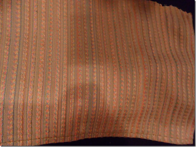
This is a close up of the fabric I had to match. Note this is a close up, from a distance of more than 12 inches this fabric looks like greenish beige.
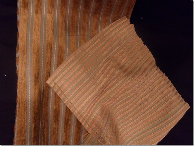
This is what I had in my stash.
It’s just a bit bolder, but still in a similar mood.
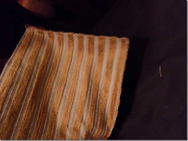
Here is one completed arm protector. I’m not showing you the three others. They look identical. Today I shipped them off to my mother.
What I do know now about color that I didn’t know when I claimed green as my favorite color is that colors just don’t exist in isolation. Very much life people, their characters change depending on who they are hanging out with.
The colors in a piece need to balance one another out. A color that may read as one thing in one setting may look completely different in another.
I have had two pieces in my work pile. Both used similar taupey colors. Often I can make those soft non –colors sing. These two pieces just didn’t work. Instead of looking all subtle and interesting, they looked tired and dull as dishwater.
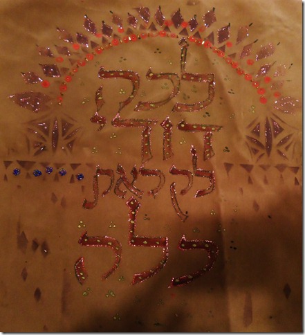
I ended up coming up with the same solution for both of them, partially because I had that pot of paint out and didn’t want to just toss so much of it. The solution to dull was, pink sparkles. Yup, the stuff that in other setting would be perfect for Malibu Barbie. The paint that would make most five year olf girls giddy with joy was the answer to my problems.
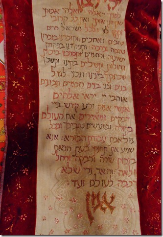
This is the center of a challah cover. Malibu Barbie pink outlining the letters saved the day.
Malibu Barbie pink came through again on this wall hanging.
Mostly, you can’t even see the pink. It’s a little like adding some sugar to a bland tomato sauce.
I’m kind of amazed that it does not look tacky. If I had known I would be blogging about my solution, then I might have had the foresight to take before photos.
I am glad that I took these two pieces ( and my mother’s chairs)out of the realm of what we in my family called “pyeckh”. Pyeckh is visually boring, what my pieces looked like before Malibu Barbie pink sparkle paint. it turns out that Pyeckh is also a name for what my father called tutu, hot water with milk, a dubious treat drunk by Eastern Europen Jews when under the weather.
So the Pyeckh is gone, both in my mother’s apartment as well as in these pieces.
Pyeckh - good word...good work. your fabric was made for encouraging the other fabric! Amazing how one continues to learn new things about colours every day. pink was perfect in both of those pieces.
ReplyDeleteover here, or at least in my husband's family hot water with milk is 'tea kettle tea'. kiddies you really think shouldn't be having tea yet are offered tea kettle tea so as not to offend their feeling of needing to be a part. and I think sometimes offered to someone who can't stomach a strong tea at that point of an illness.
Sandy